Power BI stands out as a leading data visualization tool, enabling users to convert raw data into compelling, interactive reports. Among its many features, the Table visual, Tooltips, and Page Navigation play crucial roles in improving both the presentation and the overall user experience of your reports. In this guide, you’ll find detailed, step-by-step instructions to help you build and format table views, craft insightful tooltips, and implement intuitive page navigation—all essential for creating professional, user-friendly Power BI dashboards.
Designing a Table View in Power BI
The Table visual in Power BI is indispensable for displaying granular data in a neat, spreadsheet-like format. It allows for side-by-side comparison of key metrics and provides viewers with a clear, organized view of your data.
Step 1: Insert and Position the Table Visual
To begin, open your Power BI report and locate the Visualizations pane. Click on the Table icon to insert a table visual onto your report canvas. You can drag and resize the table as needed to best fit your report layout and make room for other visuals if necessary.

Step 2: Populate the Table with Data Fields
With the table visual selected, turn your attention to the Fields pane. Here, drag and drop the fields you wish to display into the Values area of the table. Common examples include:
- Product
- Sales
- Quantity
Each field you add becomes a column in the table, making it easy for viewers to scan and compare relevant data at a glance.
Step 3: Format the Table for Clarity and Appeal
Formatting enhances readability and ensures your table aligns with your report’s style. Use the Format pane to access a range of customization options:
- Under Format → Grid, you can adjust row padding, change the font size and style, and modify grid lines and background colors to create a visually appealing table.
- To provide summarized information, enable Totals at the bottom of the table. This is particularly useful for showing overall sales or total quantities, helping stakeholders quickly understand aggregate values.
- Explore additional formatting options, such as conditional formatting, which allows you to highlight cells based on their values, making patterns and outliers easier to spot.
Implementing Tooltips for Enhanced Interactivity
Tooltips are a powerful way to enrich your Power BI reports by revealing extra information when users hover over visuals. They offer deeper insights without overcrowding the main report page.
Option 1: Adding Default Tooltips
The simplest way to add tooltips is by using default Power BI capabilities:
- Select the visual (such as a table or chart) where you want to include a tooltip.
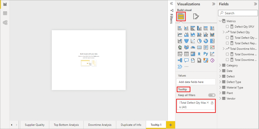
- In the Fields pane, drag the desired field into the Tooltips area.
- Now, when users hover over data points, the tooltip will automatically display additional details, such as percentages, dates, or supplementary metrics.
Option 2: Creating Custom Report Page Tooltips
For more tailored tooltip experiences, create a dedicated tooltip report page:
- Add a new page to your report and rename it (e.g., “Custom Tooltip”).
- In the page settings, turn on the Tooltip toggle under Page Information.
- Set the Page Size to Tooltip for optimal dimensions.
- Design your tooltip page using visuals, text boxes, images, or any elements that help convey richer context.
- On your main visual, choose Format → Tooltip → Type → Report Page and select your custom tooltip page. This links your visual to the custom tooltip, which will be shown on hover.
Custom tooltips can include charts, explanatory text, or even images, offering a dynamic and informative layer to your report.
Setting Up Page Navigation for Seamless User Journeys
Page navigation is essential in multi-page Power BI reports, enabling users to explore different sections effortlessly. Interactive navigation elements, such as buttons or shapes, guide viewers and improve the overall report experience.
Step 1: Insert Navigation Buttons or Shapes
Navigate to the Insert tab, select Buttons or Shapes, and choose from options like Back, Next, or custom icons. Place these navigation elements strategically on your report pages to guide users through the report’s flow.
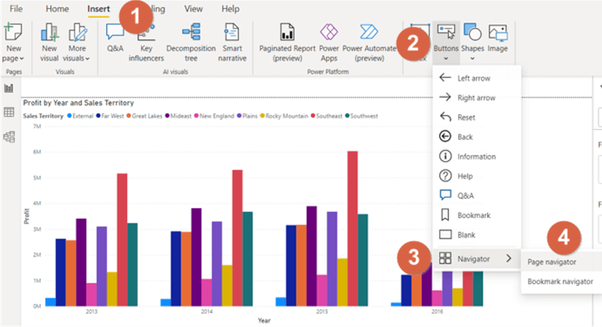
Step 2: Configure Navigation Actions
After placing a button or shape, select it and go to Format → Action. Toggle the action to On, set Type to Page Navigation, and choose the corresponding destination page. For example:
- A button labeled “View Sales Details” can direct users to an in-depth sales analysis page.
- A “Return to Overview” button can bring users back to a summary dashboard.
You can further customize buttons with icons, colors, and tooltips to make navigation intuitive and visually consistent.
Conclusion: Creating Engaging Power BI Dashboards
By mastering table visuals, leveraging powerful tooltips, and implementing interactive page navigation, you can dramatically increase the effectiveness and usability of your Power BI reports. Well-structured tables present data clearly, tooltips provide valuable context, and navigation buttons foster a smooth, logical user journey across multiple report pages. Following these best practices will help you design polished, impactful dashboards that communicate your data story with clarity and professionalism.